
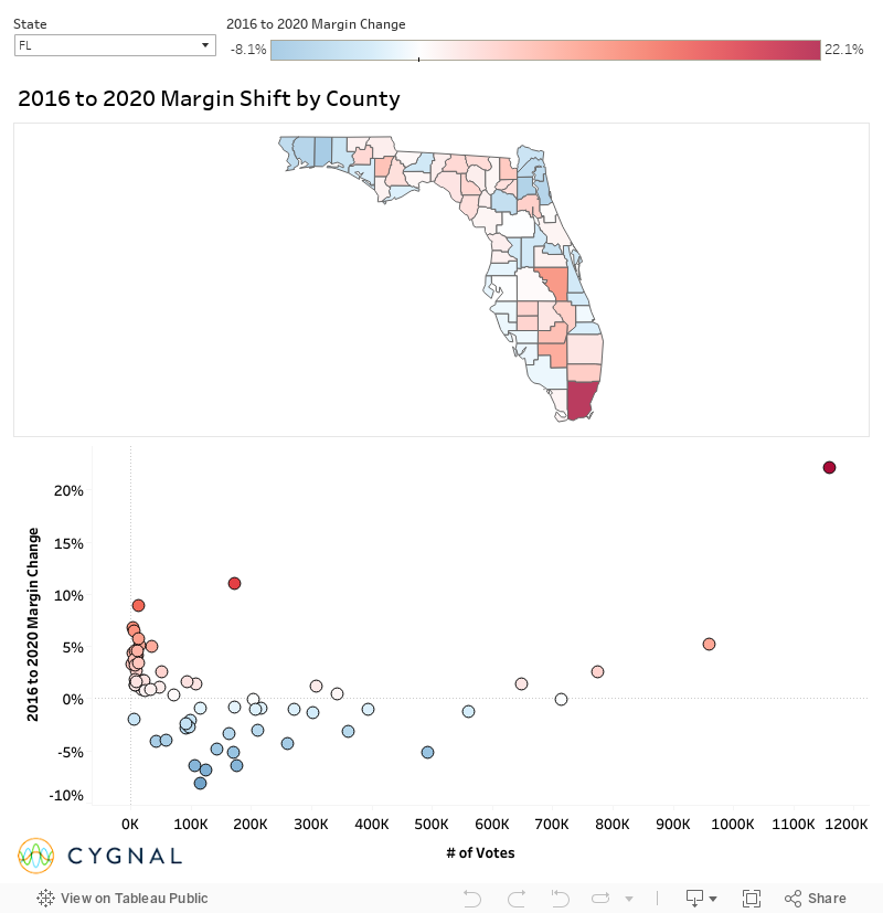
Below is a dashboard that tracks the difference in the margin between the 2016 and 2020 presidential elections. In the top left corner is a dropdown menu to filter the results by whichever state you would like to see. The top is a map and then all of the counties are plotted below showing the shift by the total number of votes in the 2020 election. Overall, there was a national trend where larger counties moved towards the Democrats at a higher rate than smaller counties, but there are still some hidden exceptions to this pattern such as Miami-Dade in Florida or New York City.
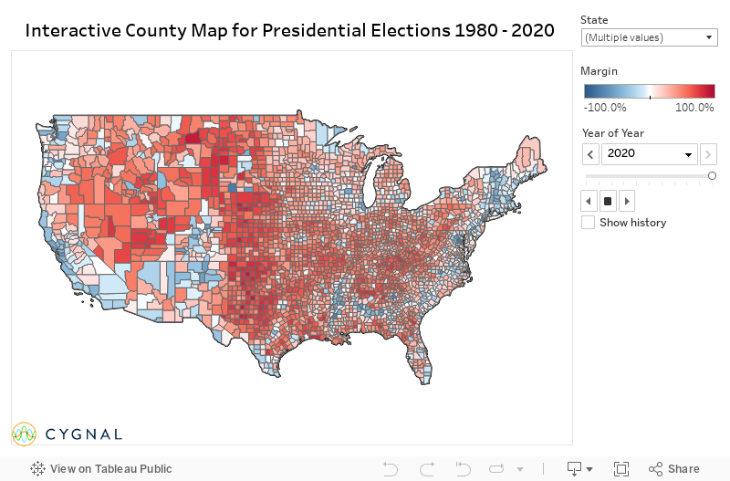
Next is a national county map of every presidential election from 1980 to 2020. If you would like to see the maps for the different years, the Year box on the right provides a dropdown menu to switch to any election cycle. The top right corner gives you the option to filter down to any state or county by clicking and unclicking a box or searching the county name. There is also an additional feature to get the full scope on election trends. When you hover over a county, a window will pop up displaying that county’s margin and the total number of votes for every election in the 40 year span. See which counties are growing or staying stagnant, whether a trend is old or new, and how the Trump era has scrambled voting patterns.
Data source: https://uselectionatlas.org/