
Though we disagree vehemently on ideology 🤫, the data team over at Daily Kos Elections has calculated the results of the last three presidential elections by congressional district, a gift for us election data nerds.
Here at Cygnal, we like to use these numbers to look at different trends over time – especially anything that concerns polarization.
To do this, we created an interactive graphic below that shows the presidential election margin in all 435 seats broken out by year.
The left side of the chart shows the more Democratic seats in blue while the right side is red for Republican seats.
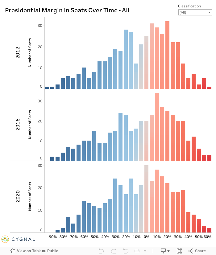
An overview of all seats shows a growing trend of safer seats for each side with 2020 having a high number of 25% to 35% wins for Democrats and Republicans.
Trump’s unique strength last year with minority voters meant that Democrat 60% wins were higher at the expense of the safest seats.
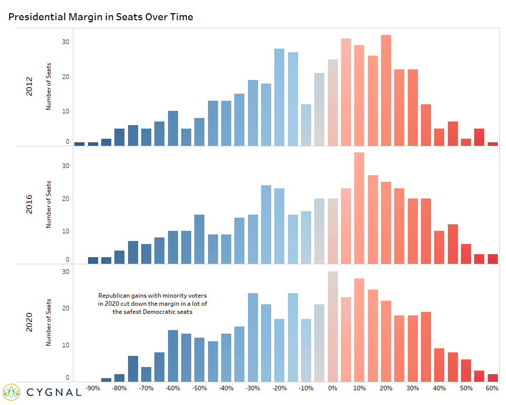
While overall movement may seem minimal, there is a lot going on under the hood.
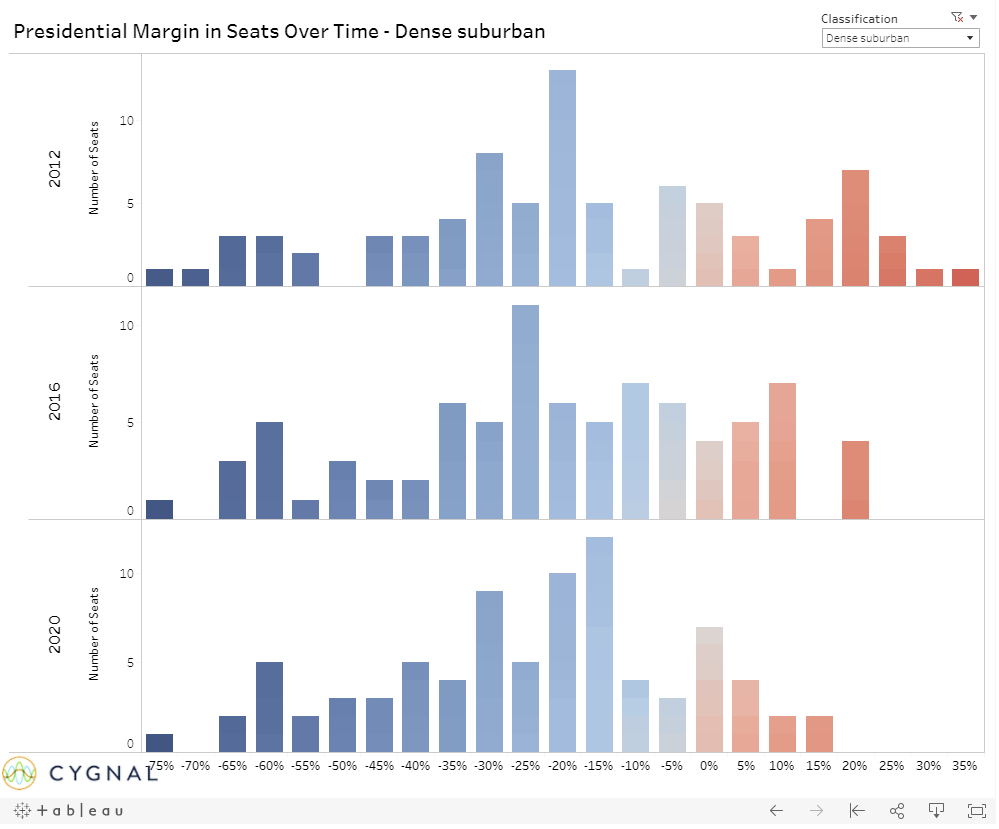
Another feature of this graphic, found in the top right-hand corner, is the ability to select congressional district type as defined by CityLab using density and demographic characteristics.
The first example is below for Dense Suburban districts which have steadily moved towards the Democrats each time and by solid margins.
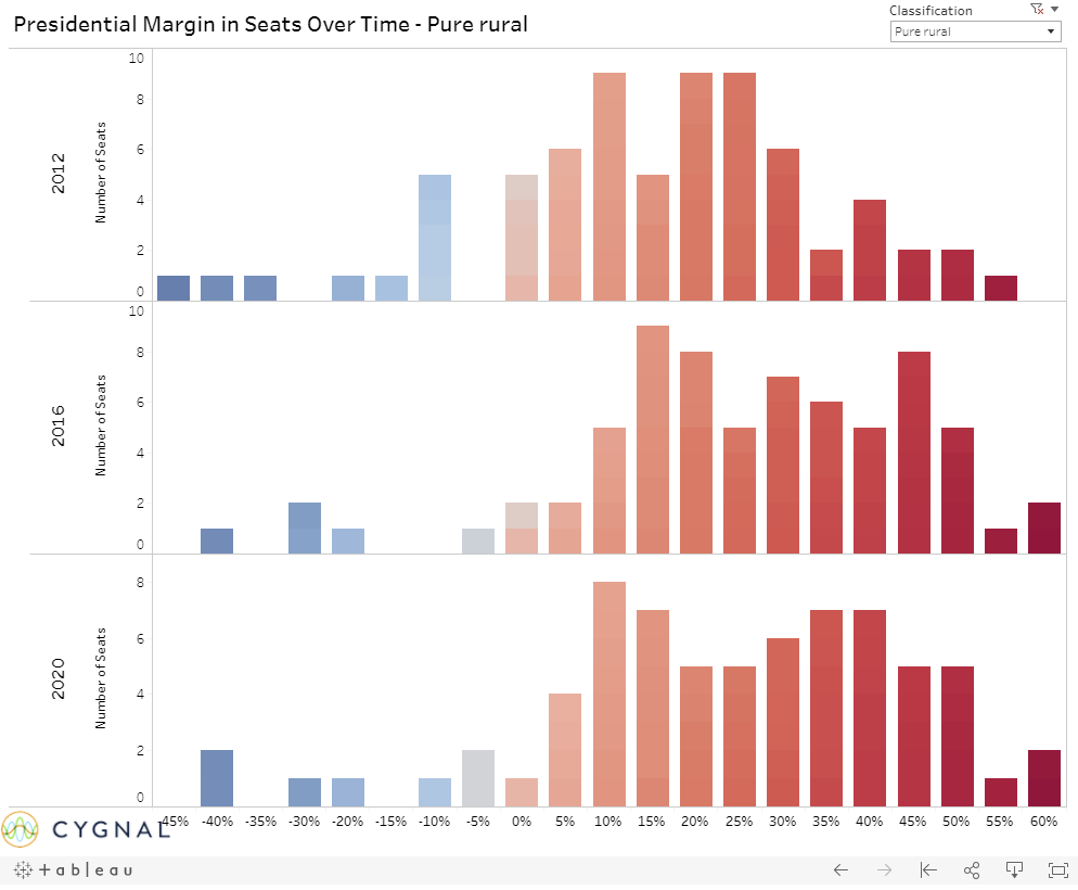
On the other side we have pure rural districts where many have taken hard right turns with a growing number of Republican wins by larger margins.
Overall, there is a lot to check out here.
Mix and match different classifications to see larger trends such as Dense Suburban and Pure Urban for high density areas. These larger trends will determine the future party coalitions and how you target and account for these could make the difference for the winner of the House in 2022.